WEEKLY POSTER COLLECTION
Week 1
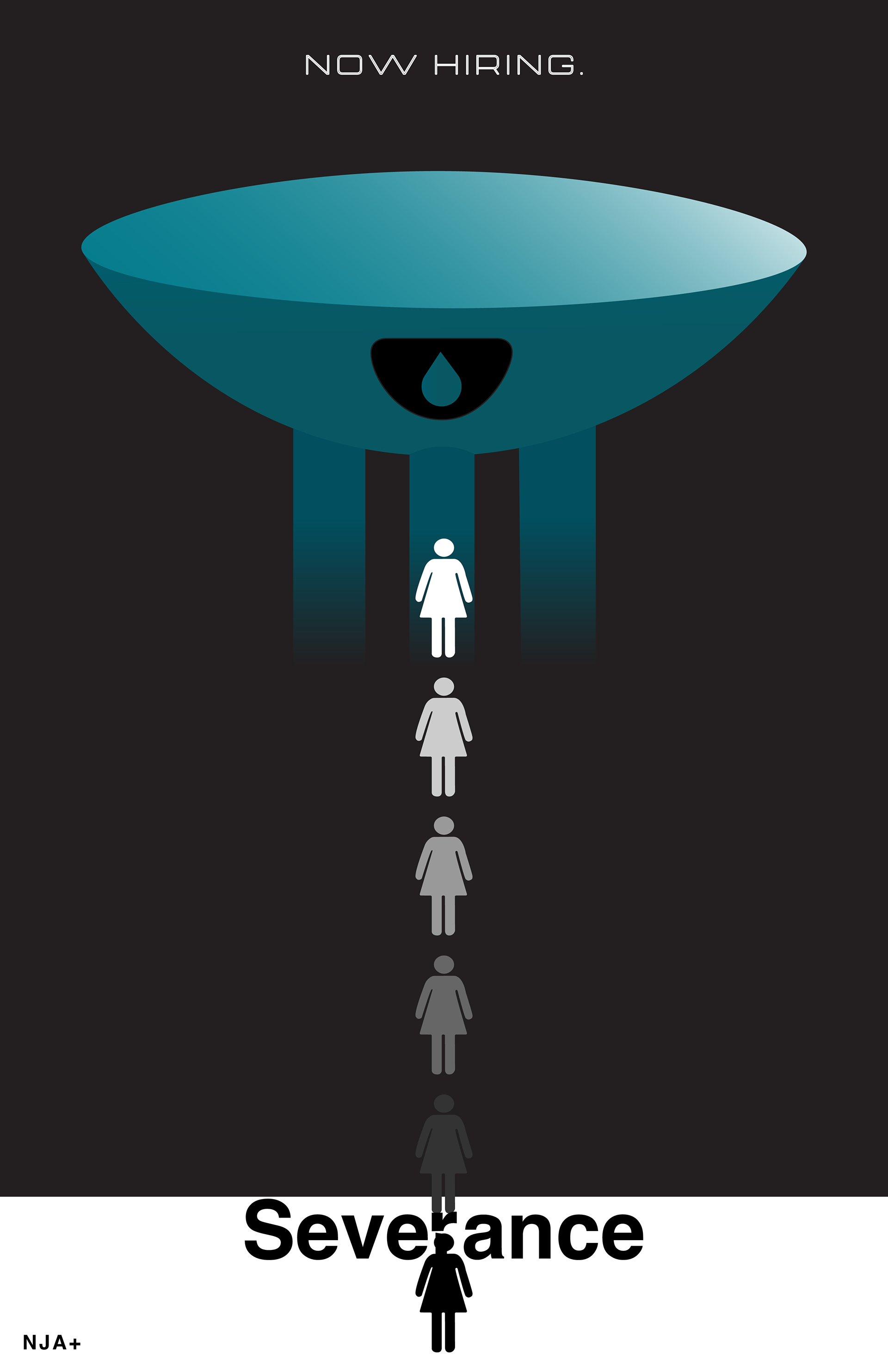
Megacorp Lumon offers employees the chance to separate their work and personal lives. Enticing, right? Employees take an elevator down to the “Severance Floor,” represented by the poster from white to black. Lumon staff constantly surveils employees, reflected in the water tower that hangs over all. Why does the last person look that way? Watch the show to find out!
Fonts: Helvetica
Week 2
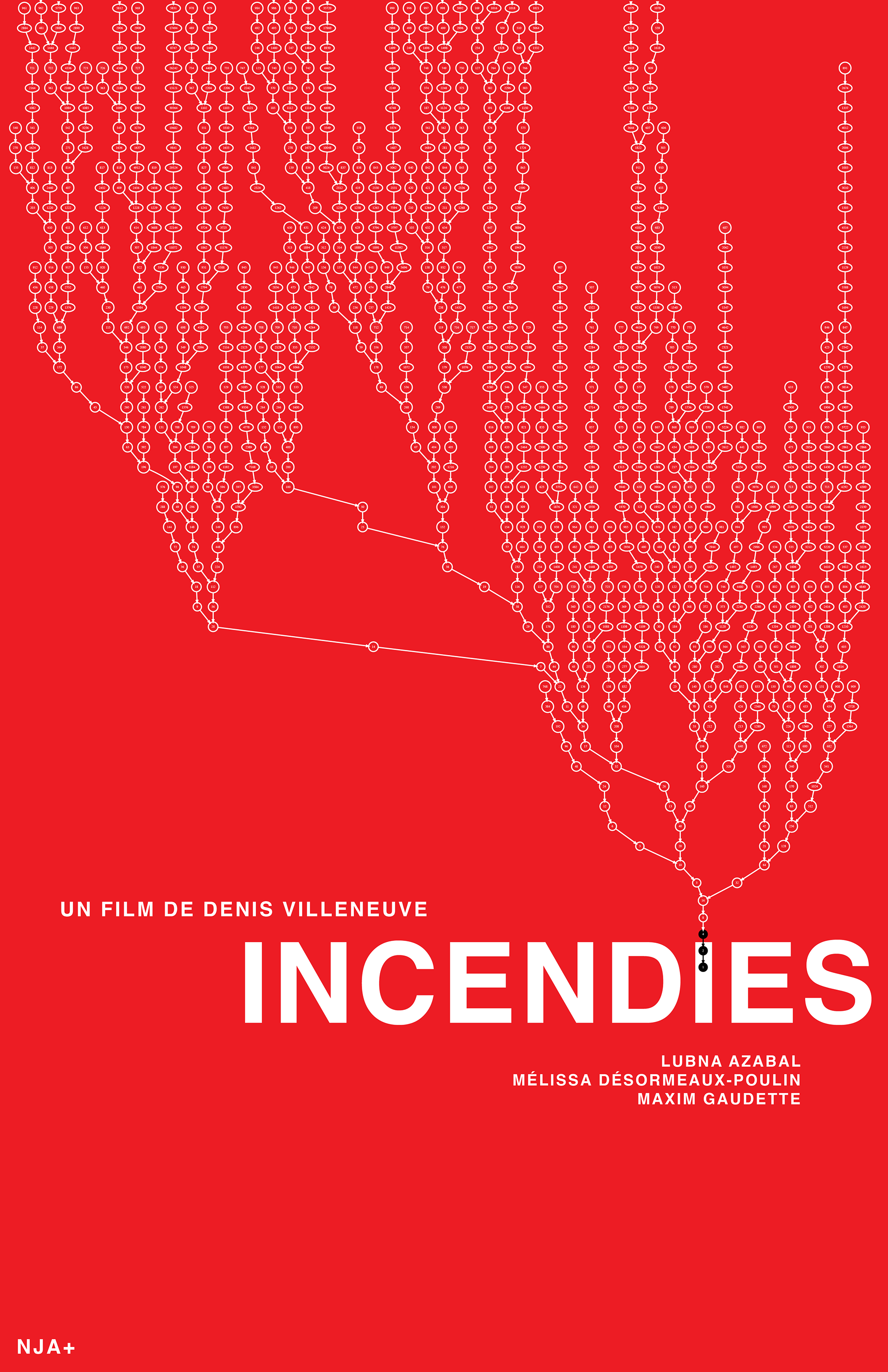
With enough repetition, do all positive integers converge to 1?This is what the Collatz Conjecture (depicted) demands, and what our protagonist—a math teacher—will find out. Truth looks a lot like fire. Feels like it, too.
Fonts: Helvetica
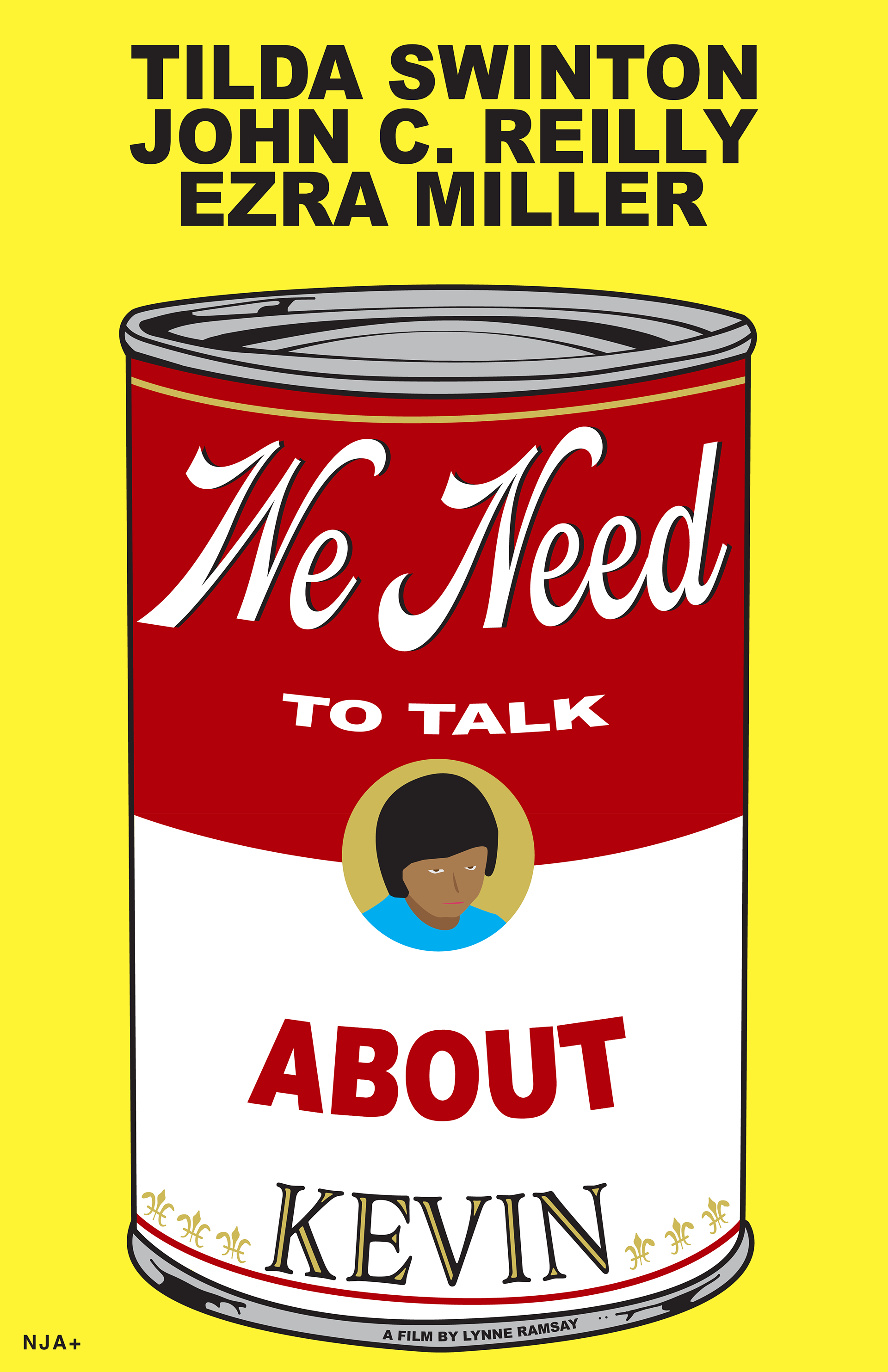
Week 3
Love comes in many forms. Many, many, many forms. Cans of soup don't play a role in the movie except as the backdrop to one scene; I thought it would make a good poster, so here we are.
Fonts: Arial, Dreamboat Regular, AdornS Engraved, Helvetica
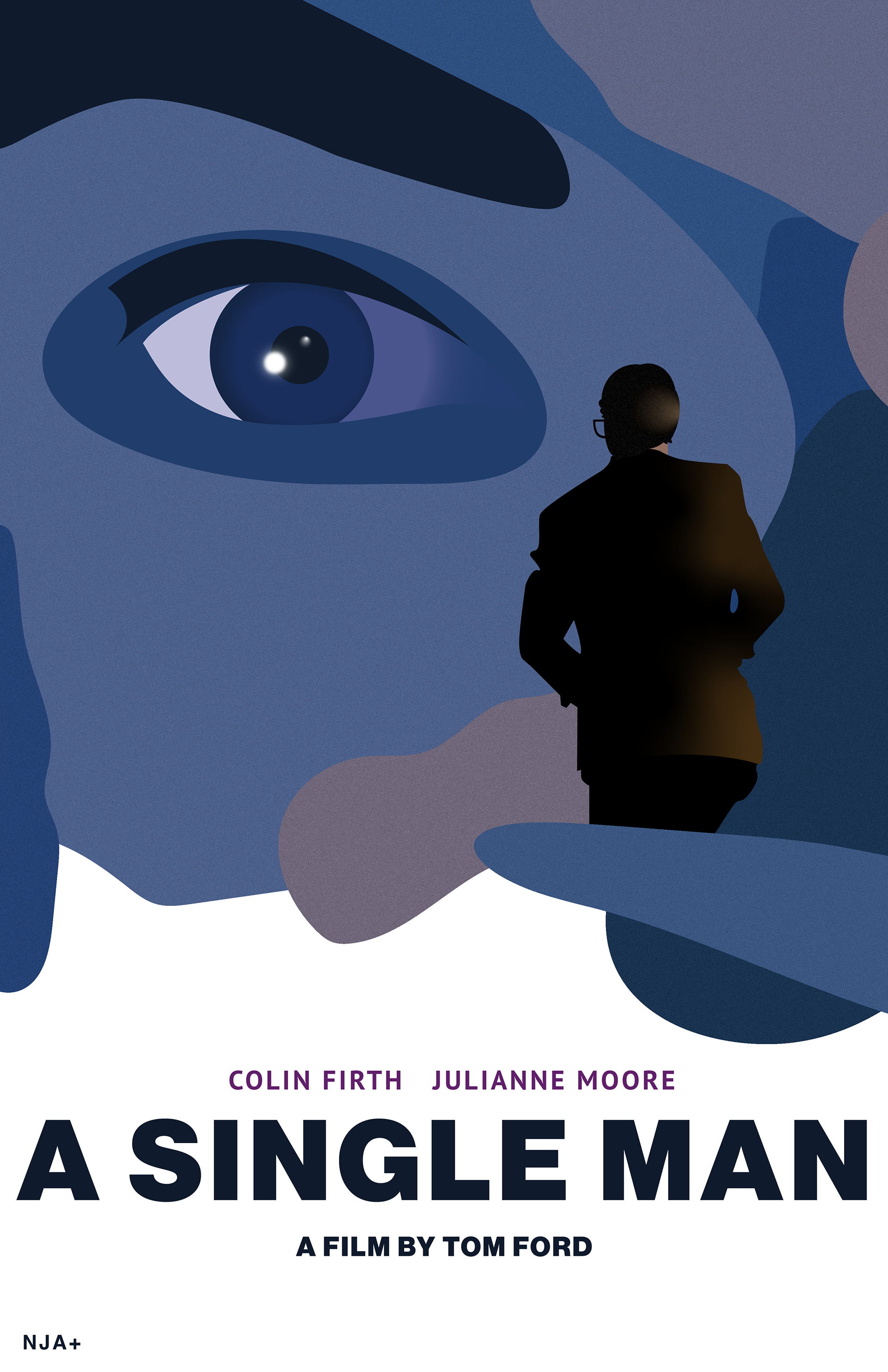
Week 4
Eight years on from the death of his lover, George Falconer is ready to die. The use of color in this movie is incredible: this is the movie that got me into movies. I made shapes with the pen tool, traced a frame from the movie for the eye, and used gaussian blur to get the lens flare effect.
Fonts: Neue Haas Grotesk Display Pro 95, PT Sans, Helvetica
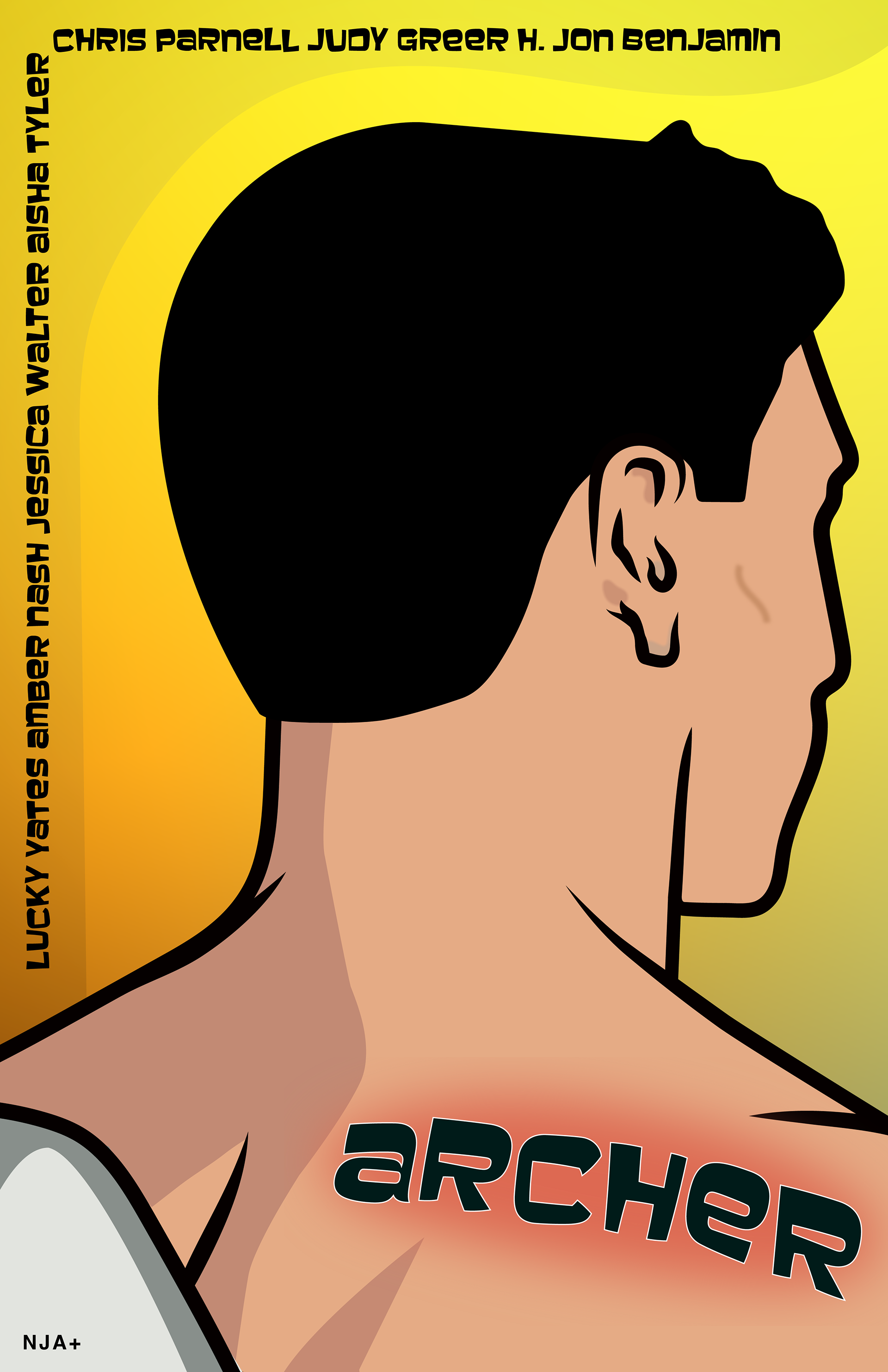
Week 5
Stupid. Funny. Stupid funny. Archer is a show about a bunch of people (spies) who hate each other, and yet would kill for each other, literally. If that isn’t the definition of family, well, maybe it should be. The show is actually animated in Illustrator (!) so this was kind of perfect. Gradient background. Pen tool for details.
Fonts: Baveuse, Baveuse 3D, Helvetica
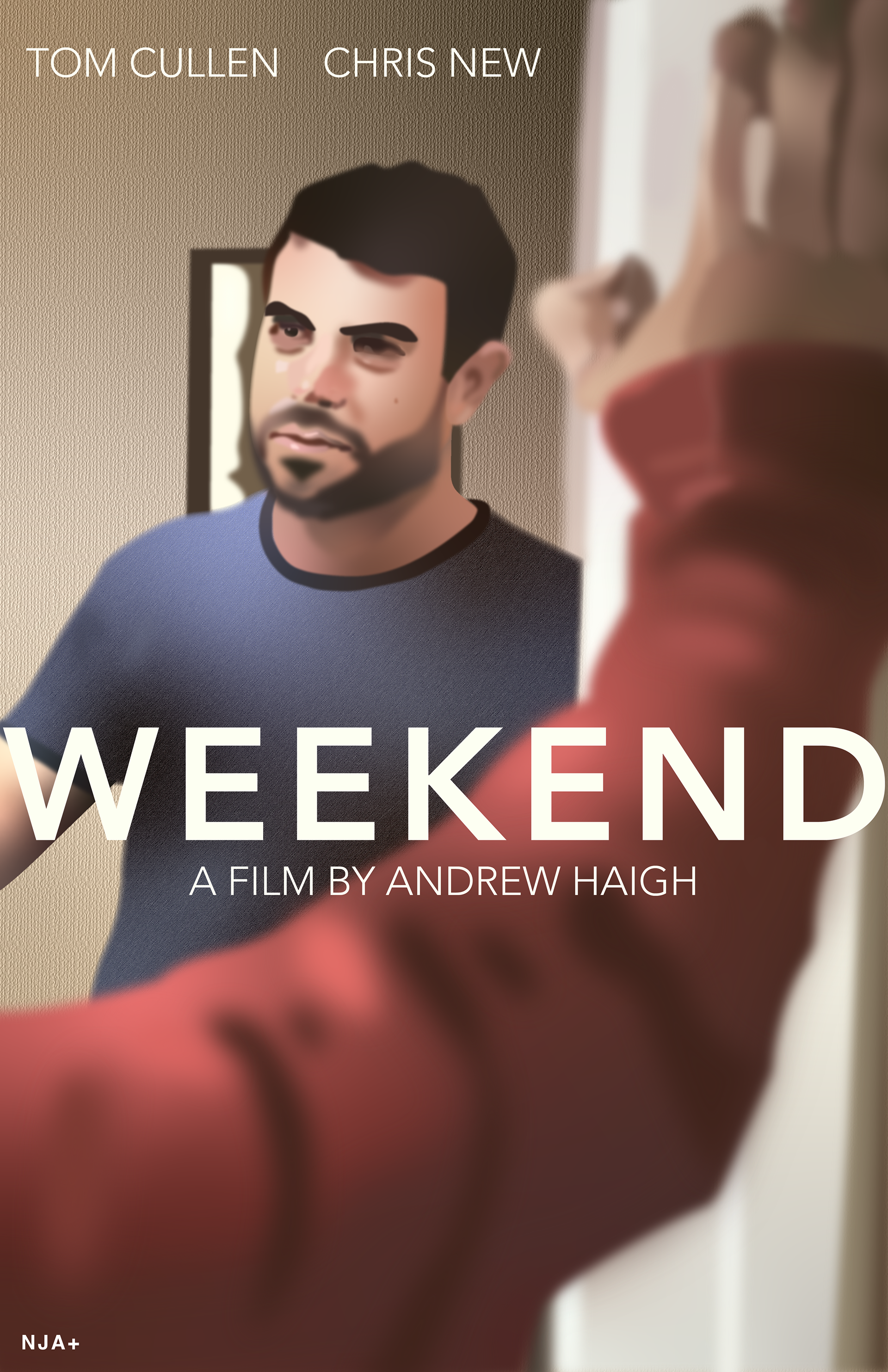
Week 6
Imagine finally meeting who you want to spend the rest of your life with, and then they have to leave the country. I went crazy with the gaussian blur. Almost everything that isn’t text are shapes drawn with the pen or pencil tool blurred to various amounts. An A for effort at photorealism. Faces are hard. But I like drawing them, I’ve learned.
Fonts: Avenir, Helvetica
Fonts: Avenir, Helvetica
Week 7
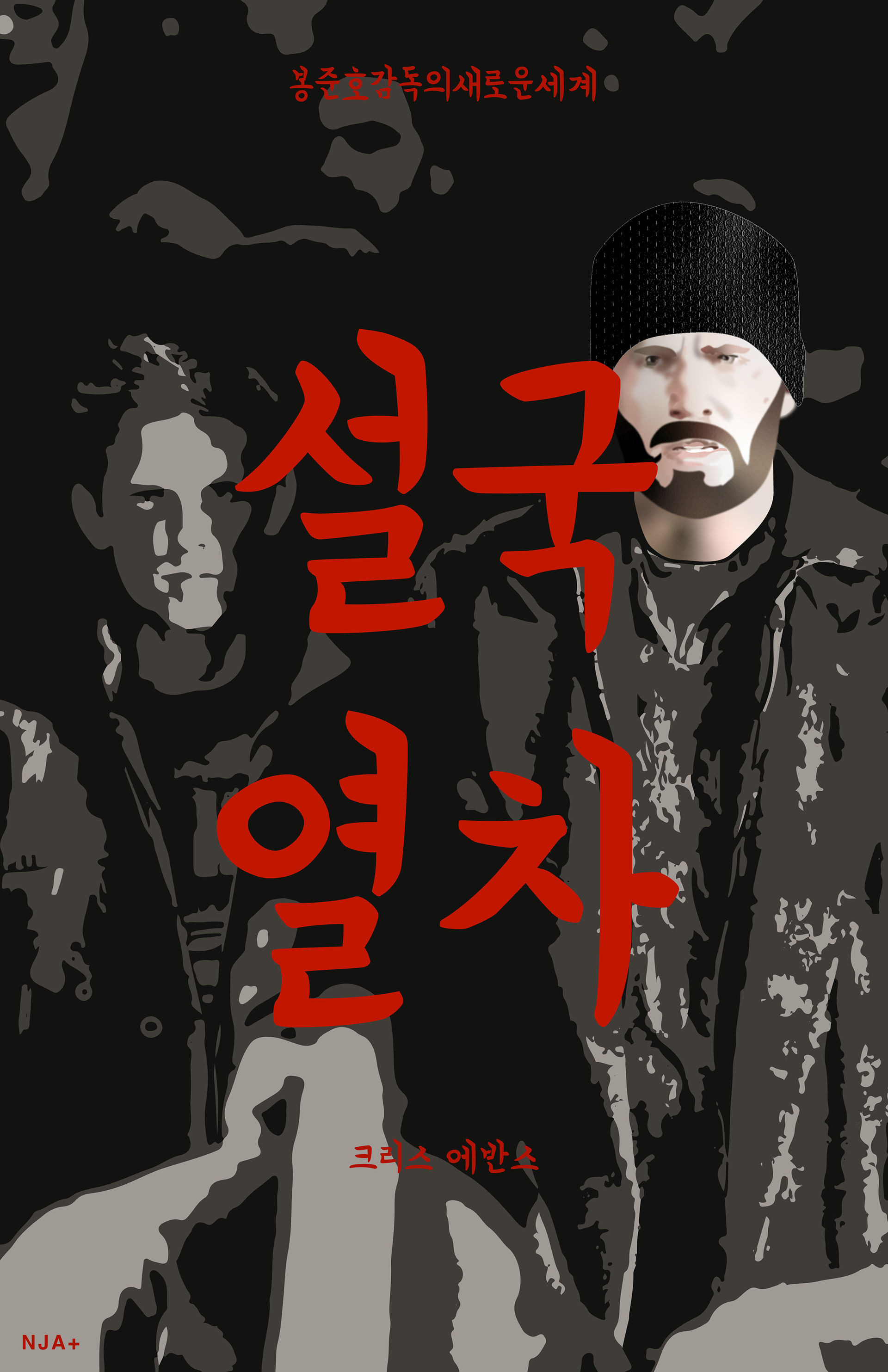
Snowpiercer may take place on a train, but it isn’t about a train. Which is a shame, because I love trains. The train is a metaphor, man. For this one, I spent most of my time trying to get Evans’ face right, which I believe I did, mostly. From top to bottom, the poster reads: Director Bong Joon-ho's New World / “Snowpiercer” / Chris Evans.
Fonts: 배달의민족 연상 (Baedal Minjok Yeonseong) OTF, Helvetica
Fonts: 배달의민족 연상 (Baedal Minjok Yeonseong) OTF, Helvetica
Week 8
Sometimes, life gets in the way of life. After a night of drinking (and more) with a friend, Alice appears to have a breakthrough: I can be free. Right here. Right now. I did lots of pen tool, pencil tool for details, and gradients. The sky was image-traced. I could have done it myself, but I didn’t feel like it. I can do whatever I want, right?
Fonts: Source Code Variable, Helvetica
Week 9
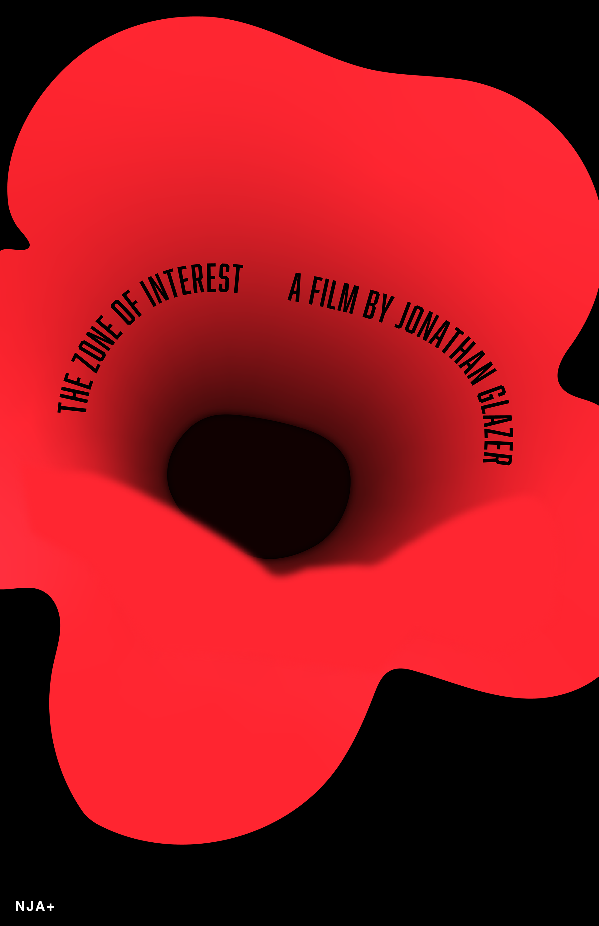
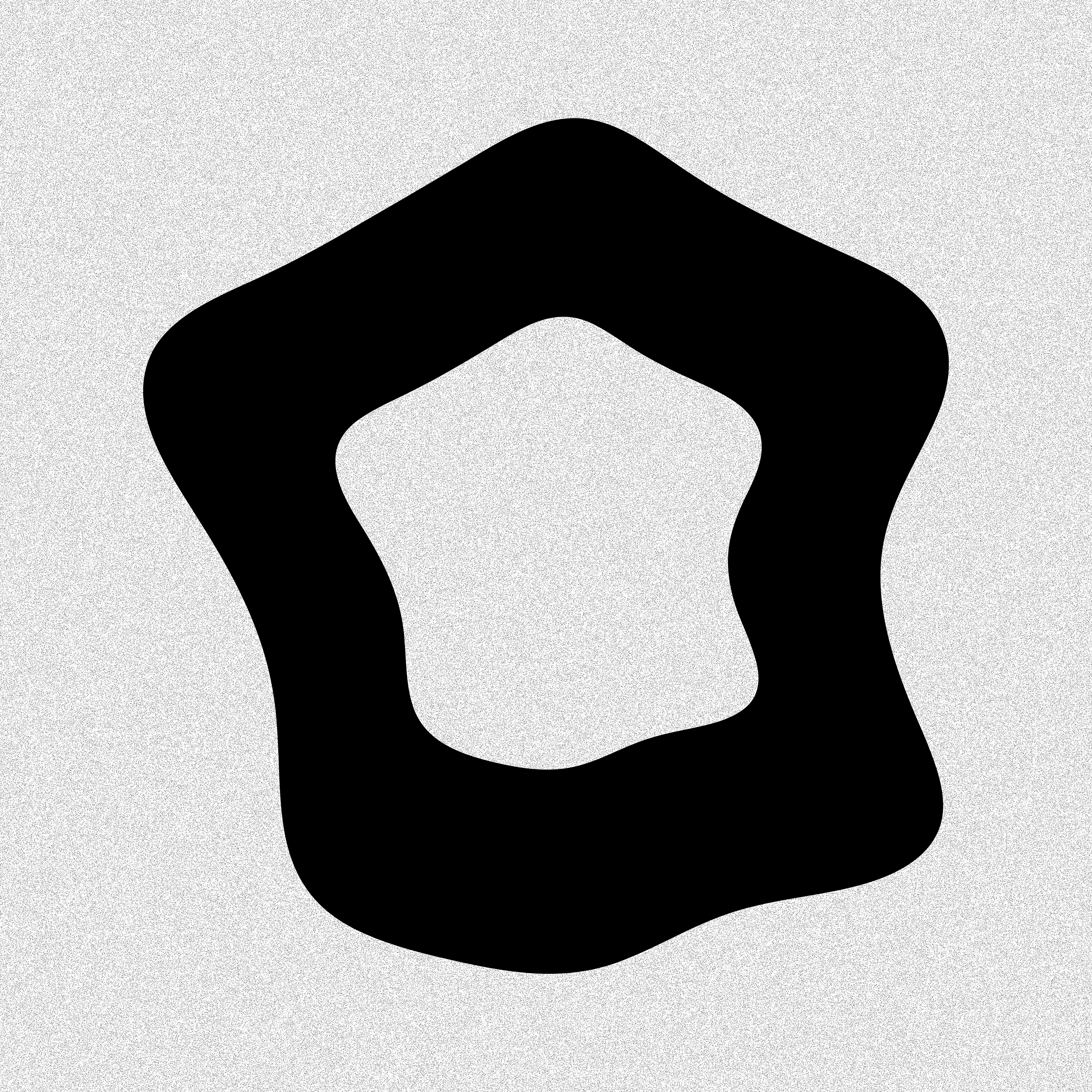
The Zone of Interest was the area around Auschwitz where the Nazis lived and worked. Inspired by one of the film’s officially released posters, the hole at the flower's center has been made to represent the camp. The title and credits surround the dark, much like how the Zone trapped its victims within the clutches of its evil. The mood is disgust. The mood is horror. The mood is shock and disbelief that lives continue to be lost to genocide even today. Red is for blood.
Pen tool, gaussian blur, path offset used.
Fonts: Abolition, Helvetica
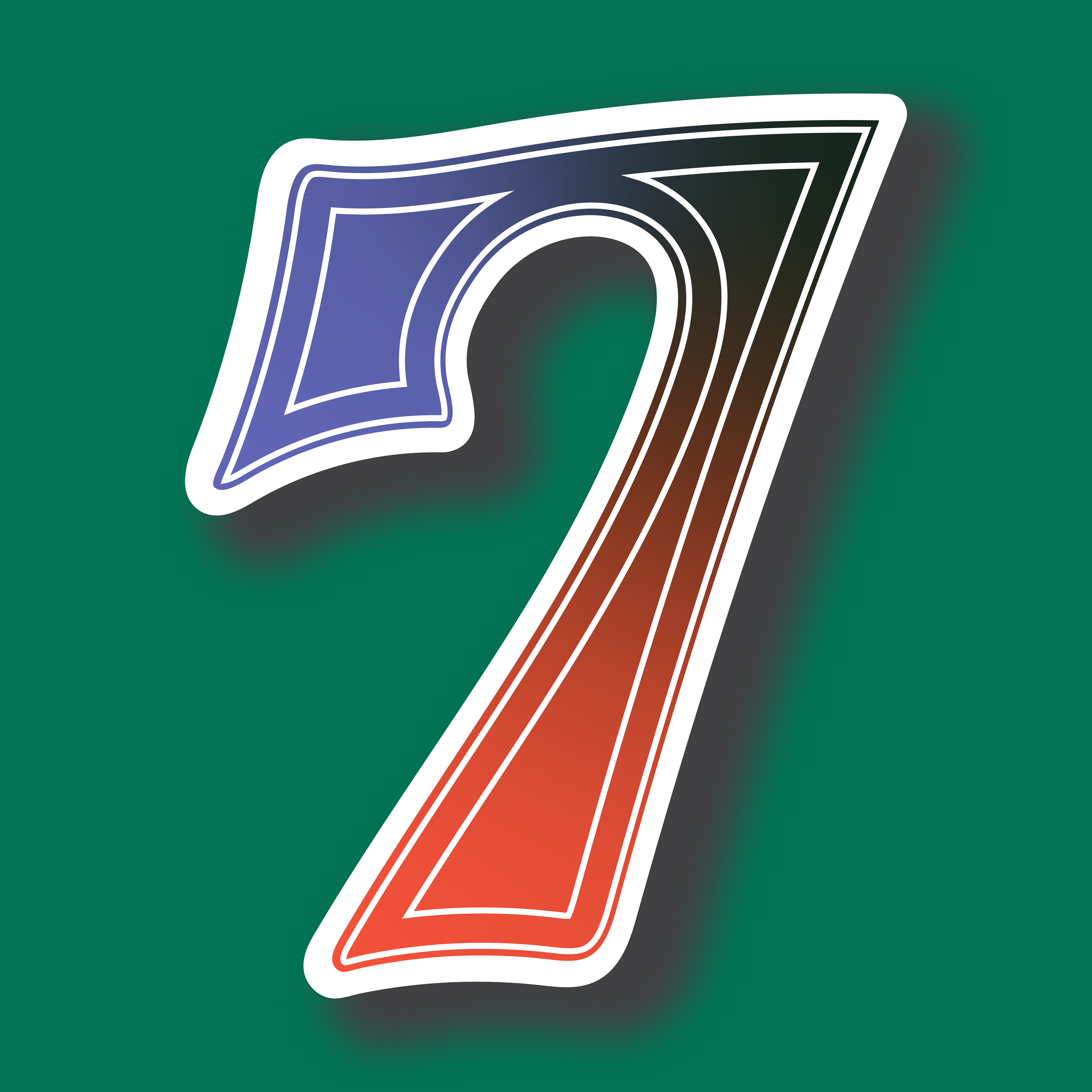
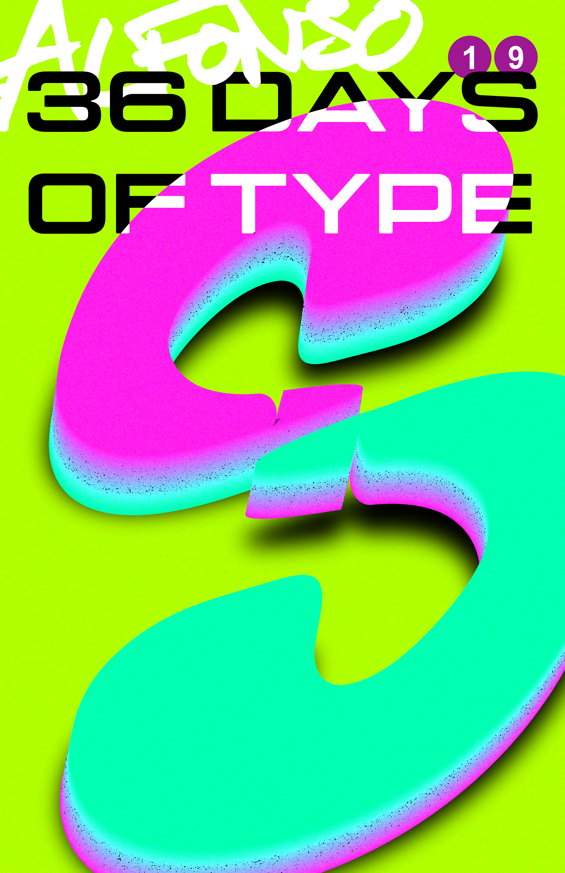
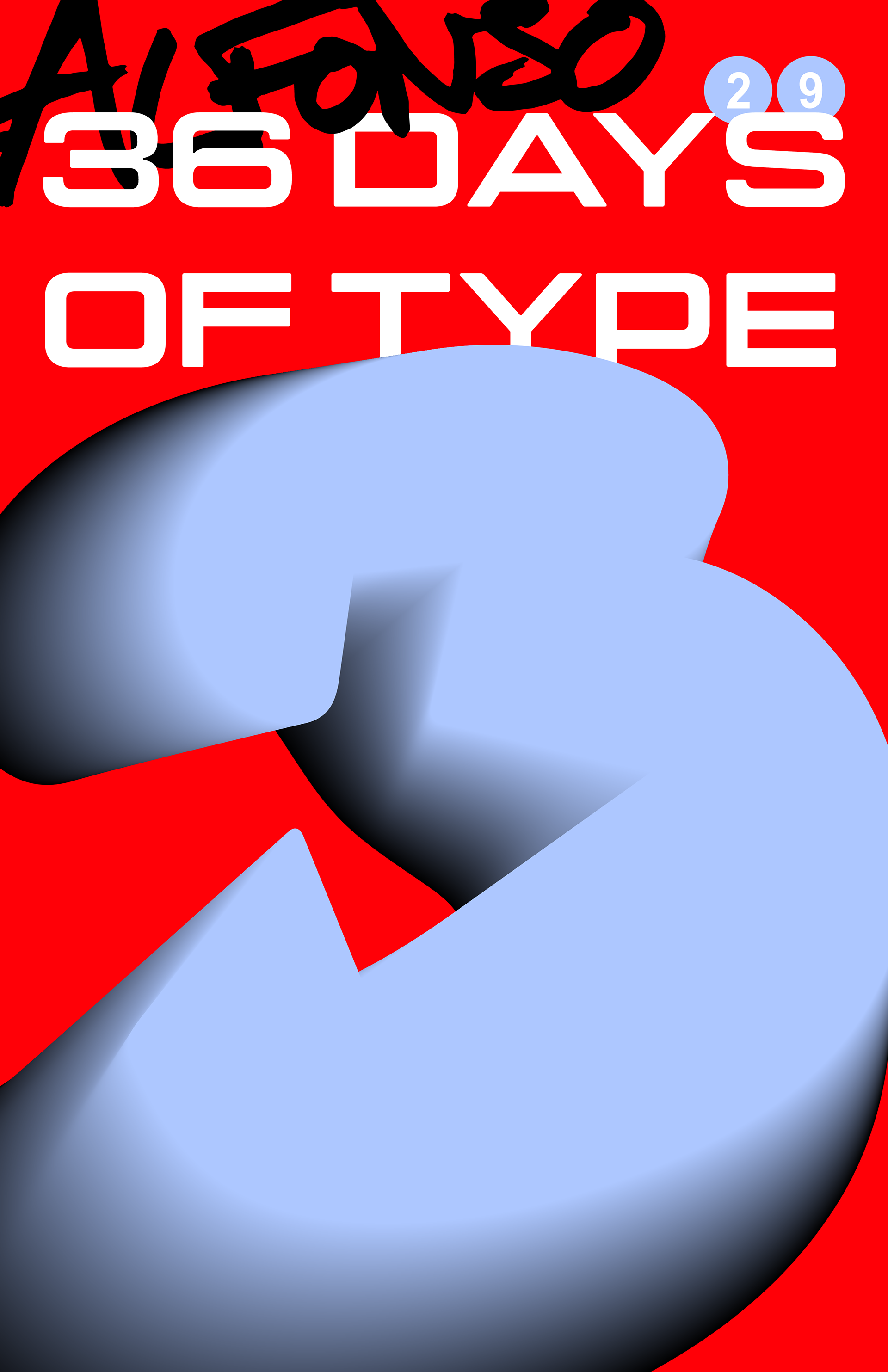
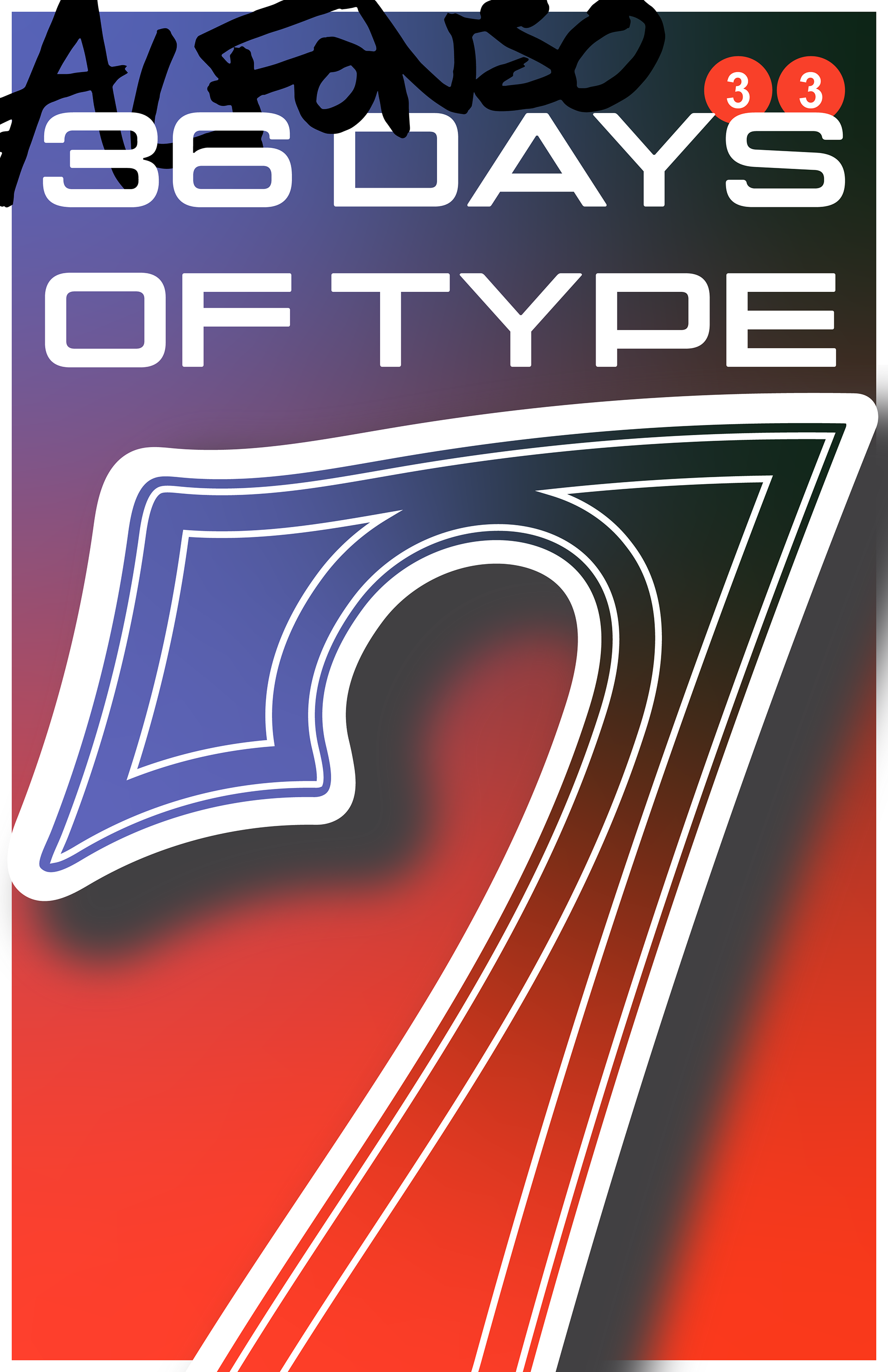
36 DAYS OF TYPE
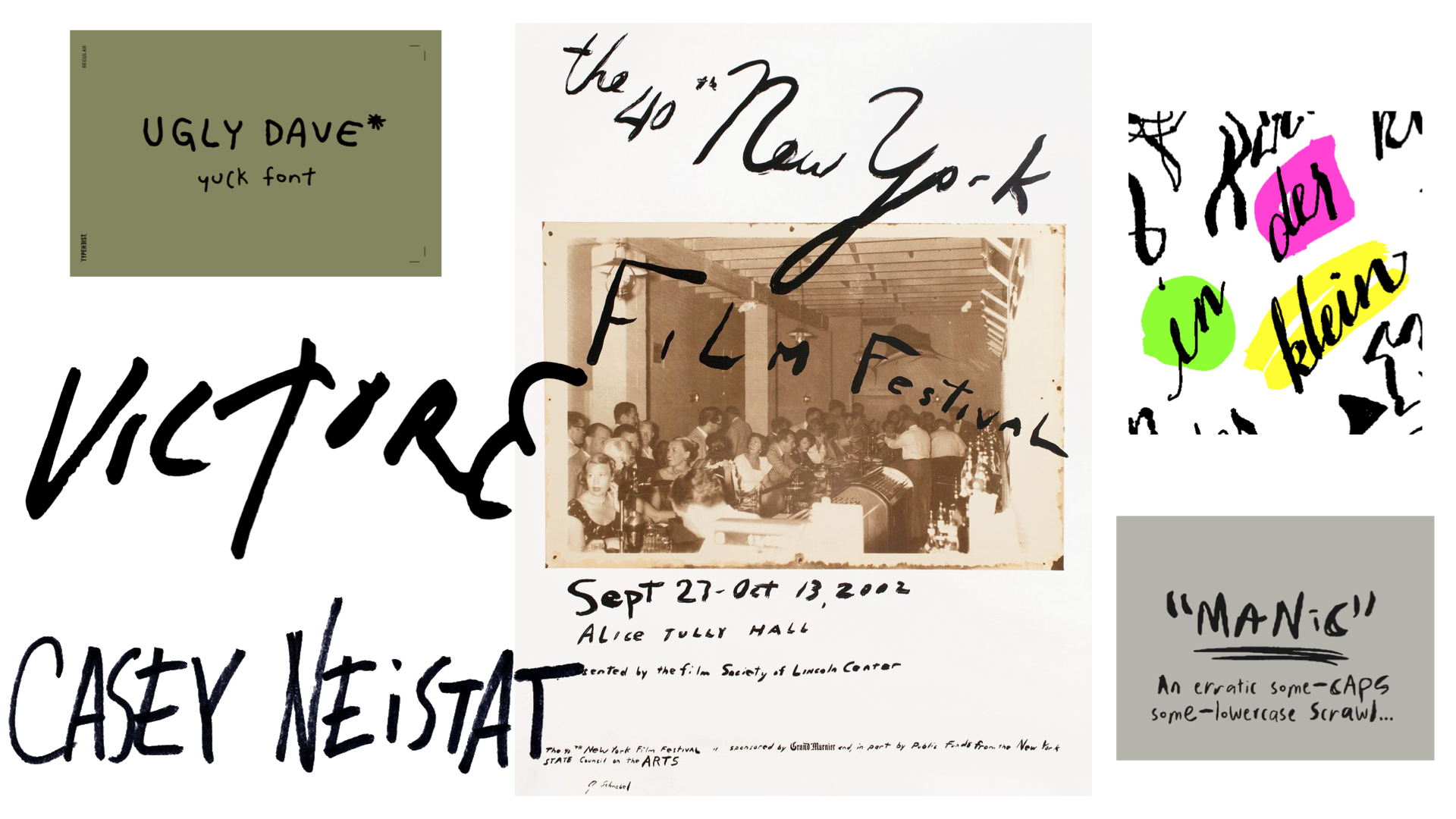
Inspiration
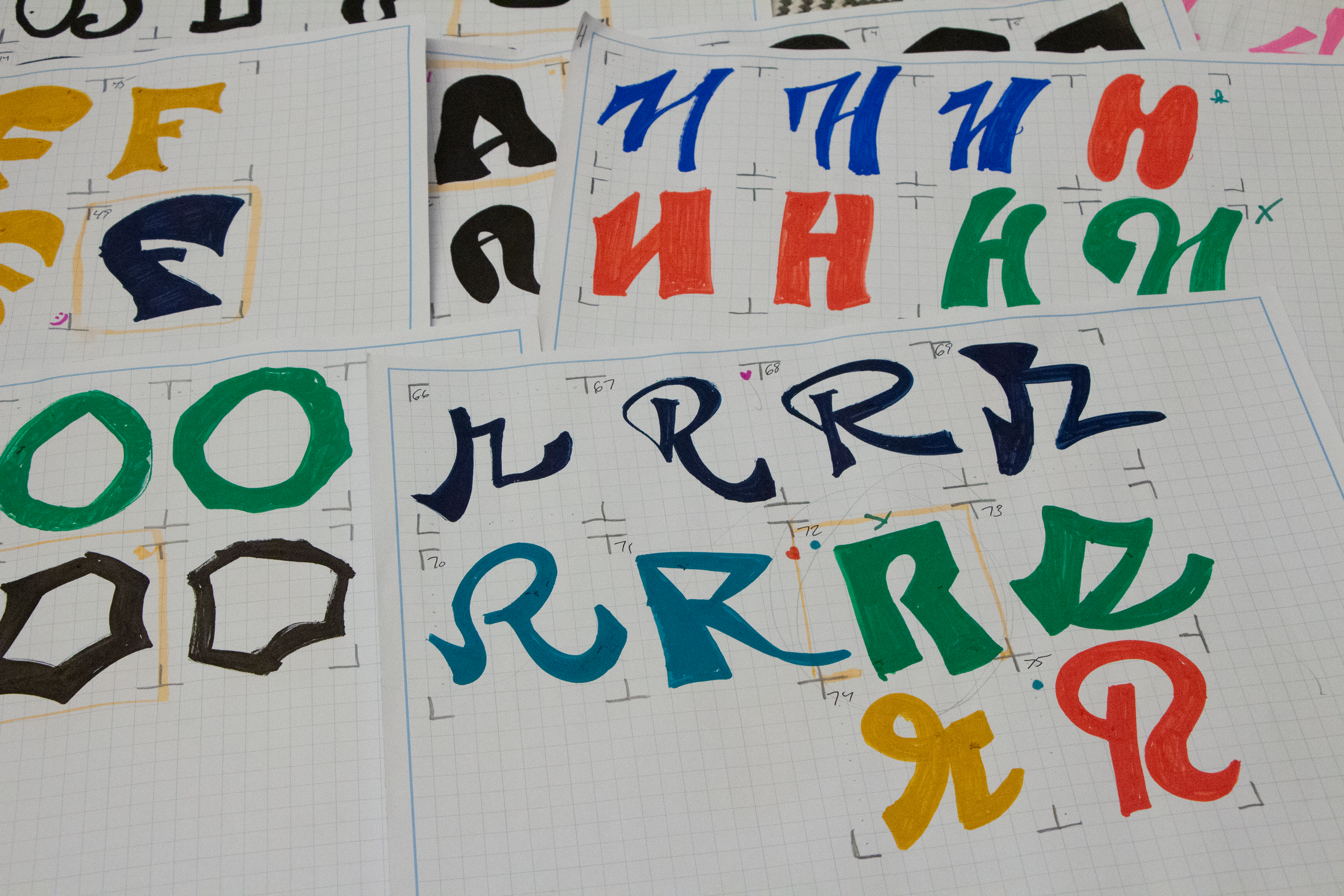
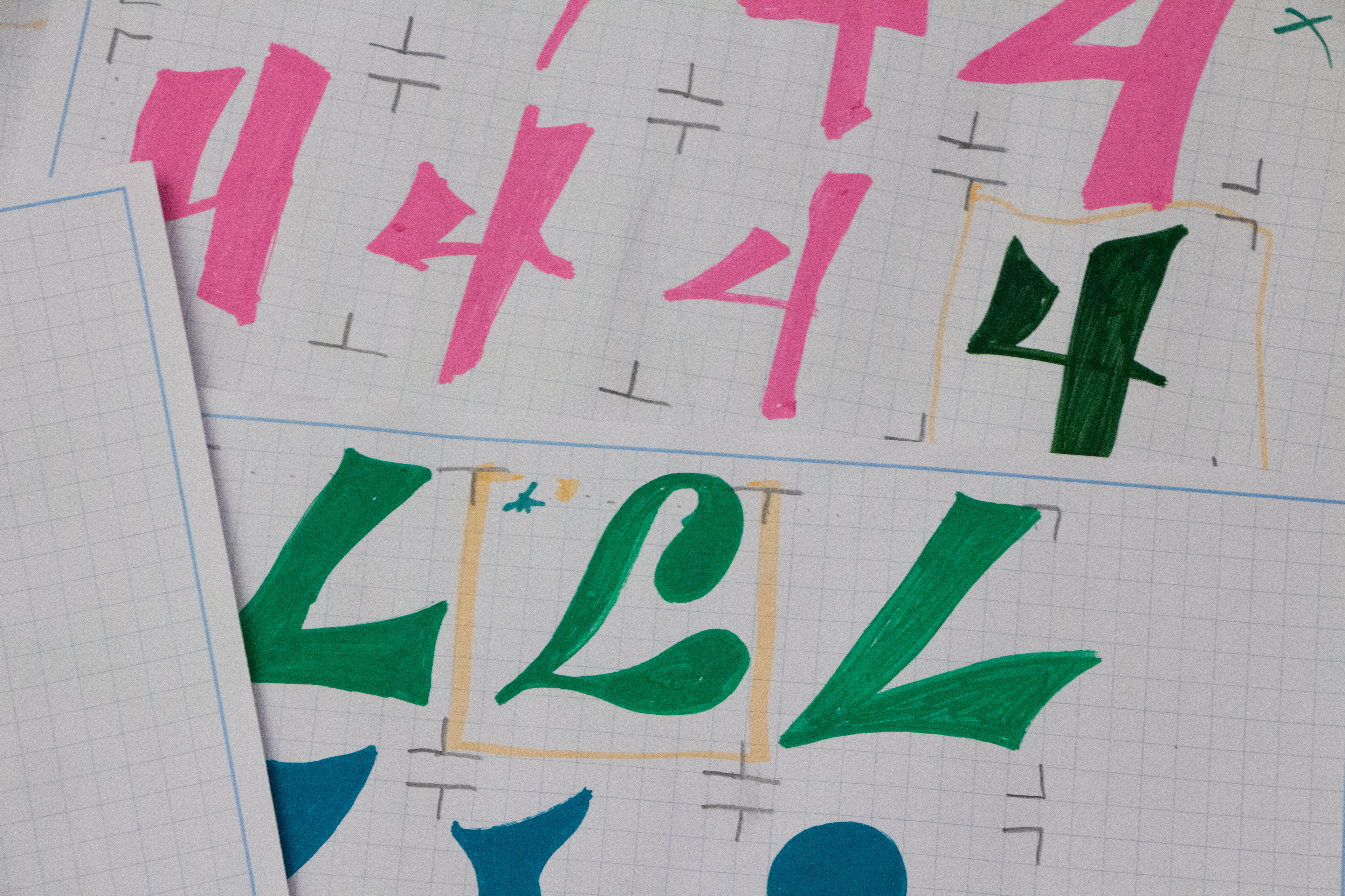
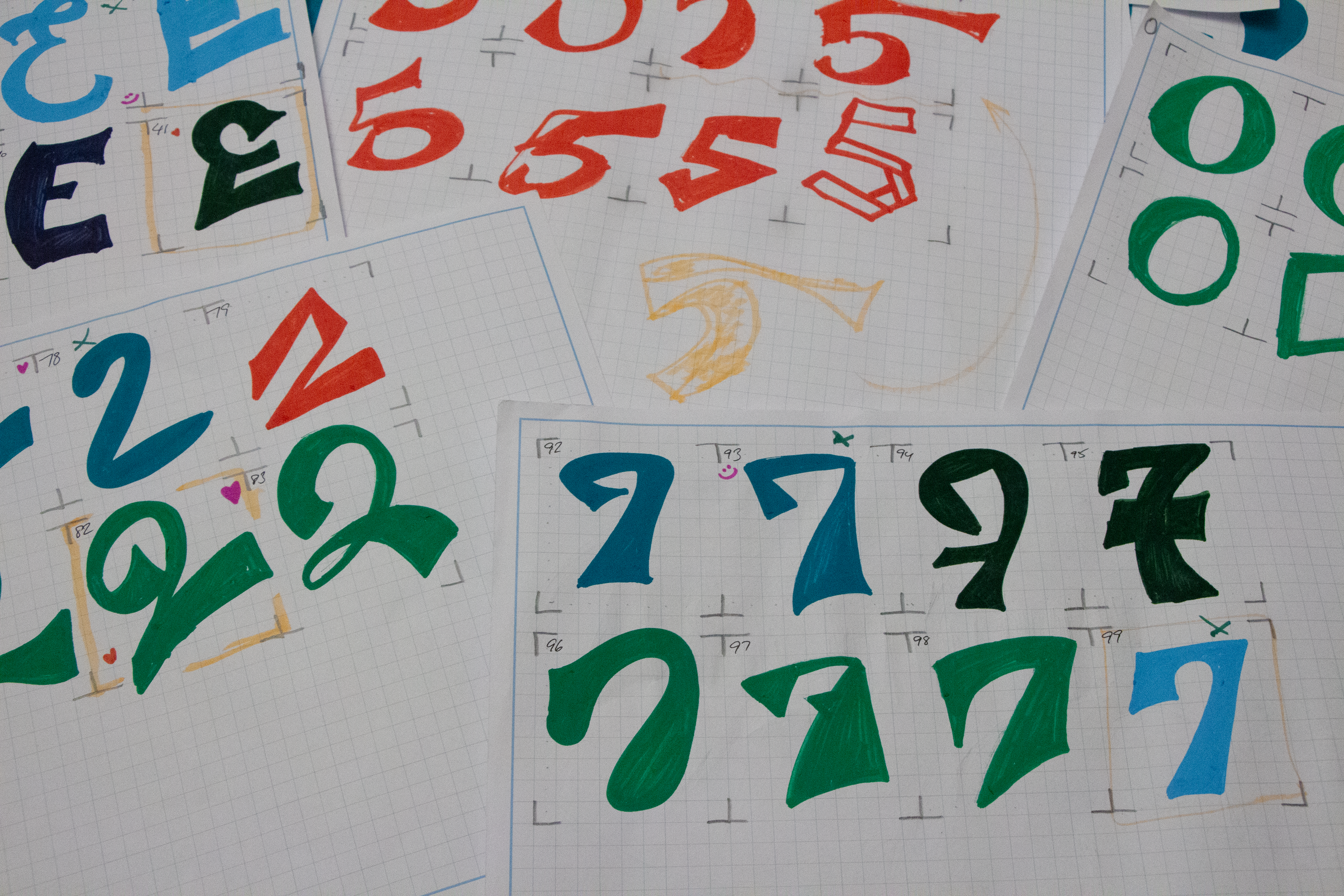
Initial Sketches
Final Set


Placement
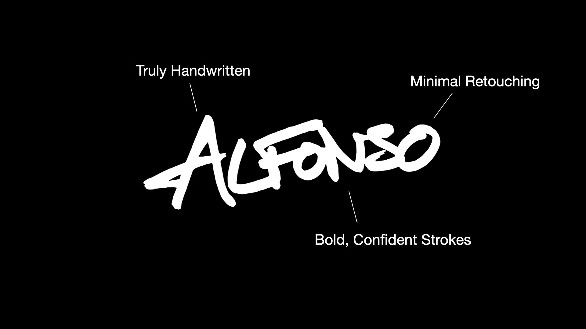
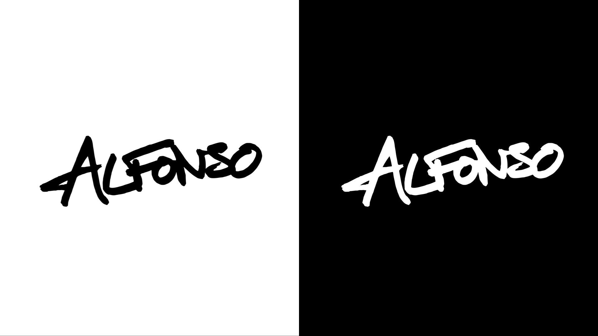
PERSONAL LOGO
Inspiration
Final Design
Analysis